Every once in a while, it feels right to do a little touch-up.
We’re excited to roll out a brand refresh on our website, materials, and elsewhere – a new look-and-feel for Village Capital as we continue to evolve our mission.
In a nutshell, we’re refreshing our visual identity (logo, colors, fonts, and other visual elements) and our language (some of how we describe what we do). Stronger incorporation of our values was a critical element of this refresh, and we’re proud to have leaned into them even during the process. Eschewing external services, our team led the work, allowing us to give the choice to the voices that matter.
We’ve always tried to stay ahead of the curve, and as we’ve expanded our reach, we can’t think of a better way to connect with our audiences than through a powerful brand. Branding for us is the language that fuels the experiences you’ll have when you embark on a journey with Village Capital – through mentoring, investing, or learning. Read on to find out why a brand refresh was critical at this point of our journey, how we did it in-house and how it will impact our audience, and get an overview of our new look!
We’ve been building toward this refresh for a long time.
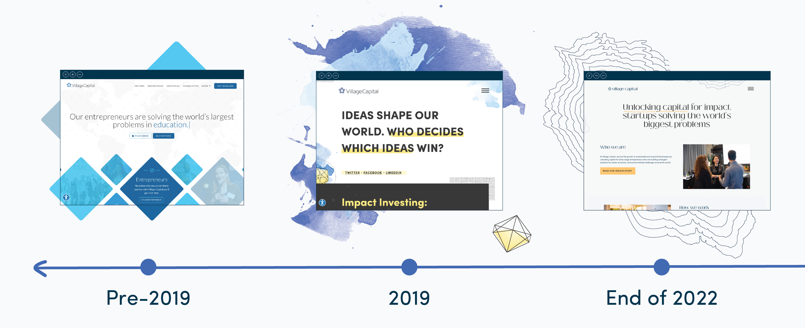
For those who have been following our work for several years, you’ve seen our website evolve from a simple Wordpress site, to a diamond motif, to the watercolors-and-polygons imagery we’ve used for the past few years; the abstract shapes representing the innovative nature of the startups we work with.
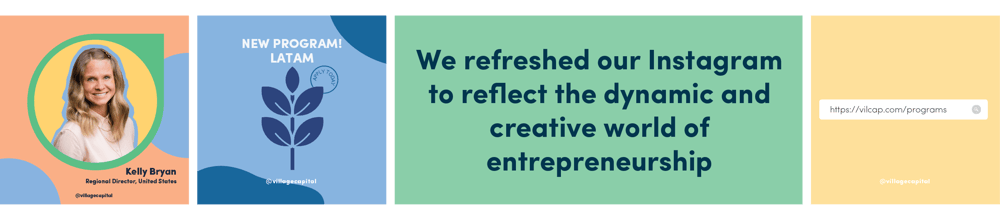
Last year we launched a new chapter in our visual look, rolling out a curated Instagram page that previewed a lot of what we’re launching today. In addition to piloting more engaging content, like video dispatches from our team members around the world, we also incorporated the Abaca colors to fit our inspiring and joyful content around entrepreneurship.
This shift was the result of rethinking how we could adapt our visual identity to stand out in digital spaces, especially on a super-visual platform like Instagram. Bringing in more organic shapes, warmer colors, and movement, we wanted to reflect the dynamic and creative world of entrepreneurship. We’re in the business of supporting ideas and making them a reality; any startup is in constant motion and (hopefully) expansion until it reaches sustainability. We wanted our audiences to be able to instantly connect to this and the values we wanted to shine through most: storytelling, resource-sharing, and spotlighting our team and network).
We’ve also built some exceptionally creative brands for individual projects, like our work with Resource, our “accelerator for accelerators” focused on BIPOC-led ESOs. For that project, we used maps as a leitmotif that represents that innovation comes from all over the US. At Village Capital, we center lived experience and the WHY behind the founders’ stories, so we decided to hone into their anecdotes and create different types of collateral to amplify them.
For our brand refresh, we first thought about people – our different audiences.
For an organization like ours, this is a complex task because we engage with different stakeholders on different levels – entrepreneurs, investors, incubator and accelerator leaders, business leaders, philanthropy and aid professionals, activists, NGOs, and more – but we were certain that was the starting point to achieve our goal of building stronger connections.
We did interviews, surveys, and different exercises with various elements of our audience to refresh our perspective and include a wide variety of ideas, including feedback from our partners. One important note: we didn’t hire an external agency to do this for us; instead, our internal creative team drove the process. We are proud to say that the people who know our work were a key part of it. We analyzed what really matters to brands that center community and we found a pattern: they think about branding as a micro universe.
The next step was to synthesize feelings, values, and priorities into visual elements. We refreshed our logo and named the new elements as we worked through them. Referencing them with words creates clarity and sets a reason for being. The brand’s elements were chosen because they all contribute to the micro universe, not just because they look nice.
Our five-star image, now the Community Icon, represents what’s most important to us: our community spread across 90 countries, which has given us the largest network in impact investing. We changed the line’s stroke to align with our new elegant font, while also making the logo all lowercase and one solid color.
Having that community in mind, we’ve replaced the watercolors-and-polygons look with a motif that centers around hand-drawn maps – jagged outlines representing places where Village Capital works. Look across our website and you’ll see strips of Sub-Saharan Africa’s and Latin America’s coasts, Southeast Asia’s Archipelago, and many others.
Next, we refreshed our colors. Originally, Village Capital was represented by dark and light blues. During our previous brand update, we incorporated goldenrod from our VIRAL framework to represent the joy of new innovation. Now we’re expanding that even further, adding hues of white, tan, and gray as secondary and accent colors to represent one of our most important values; we’re on the ground, helping the communities we serve decide what benefits them.

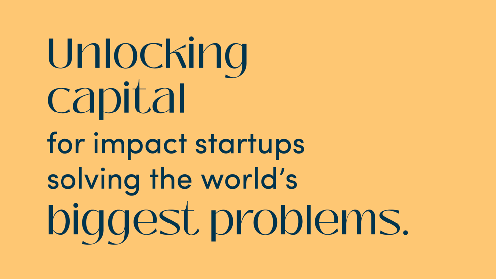
Finally, we’ve updated some of our messaging, describing what we do. Notably, we have a new tagline on our home page: Unlocking capital for impact startups solving the world’s biggest problems. We think it’s a simple encapsulation of the work we’ve done to support more than 1,400 different startups over the past twelve years - and the tens of thousands more we’re looking to support in the next decade.
Ultimately, our goal across every aspect of our organization is to connect with and serve early stage entrepreneurs who are building emergent solutions to real problems around the world. We wanted an identity that spoke for this large network of impactful, innovative founders we represent. A brand refresh that was more than just updated visual assets. One that re-solidifed why our organization exists.
Thanks to the great work of our internal creative team, we’ve managed to accomplish that and more, while still maintaining a link to our past. We’re still the same VilCap, and we’re preparing for what’s next. Follow along with our brand refresh, and our new projects, and learn how to get involved.